
The brief for Abbott Nutrition saw my team and I construct a full set of Brand Guidelines for Abbott Nutrition’s new packaging design, showing design agencies around the world how to apply the brand and their new pack visuals to the print materials they would produce in each market.
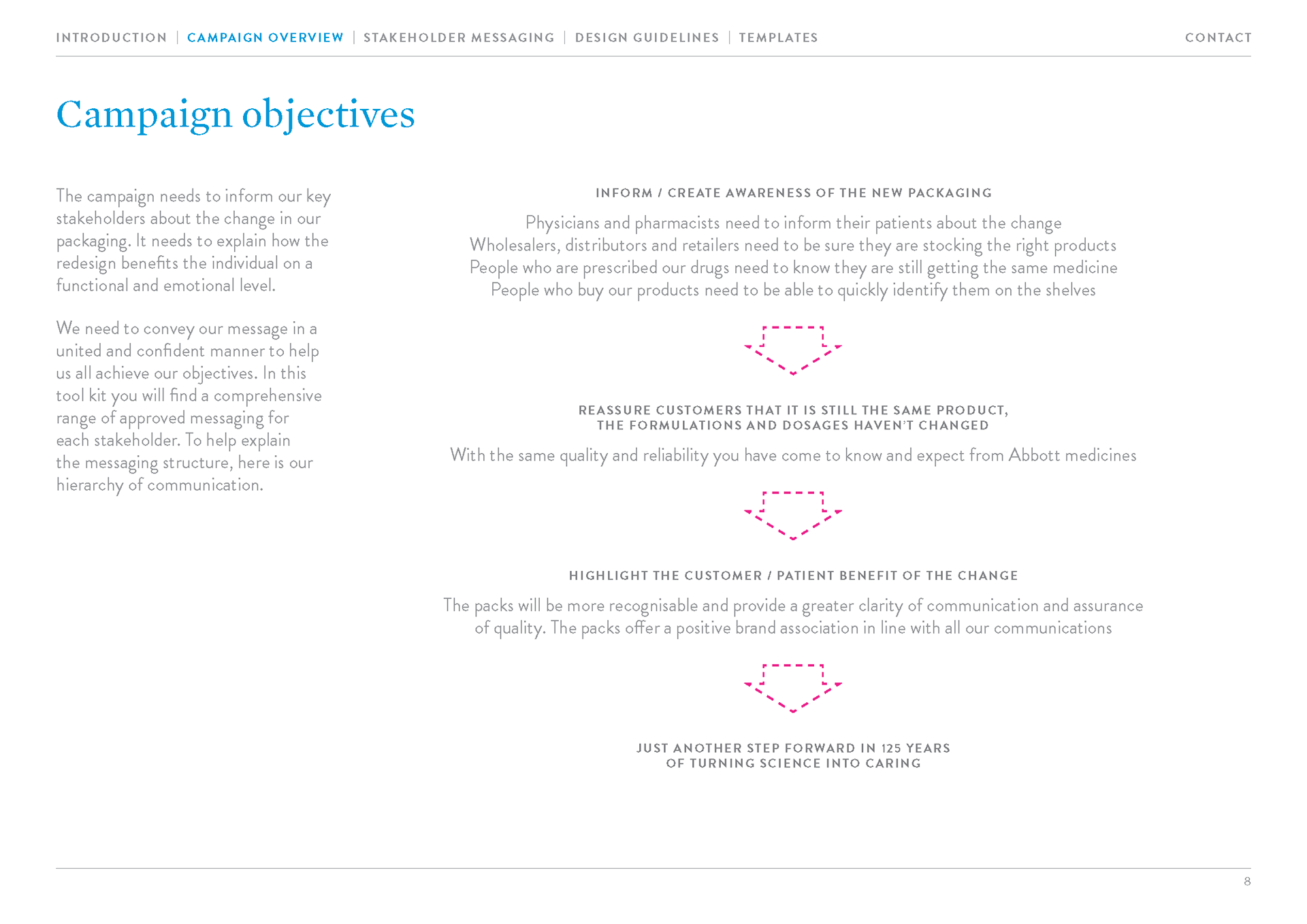
The aim of the new pack was to encourage consistency across the global brand, simplifying existing disparate packaging designs and unifying them to generate more trust in the brand. This placed a lot
of pressure on me to ensure the reinforcing of these values and objectives within their guidelines.
of pressure on me to ensure the reinforcing of these values and objectives within their guidelines.
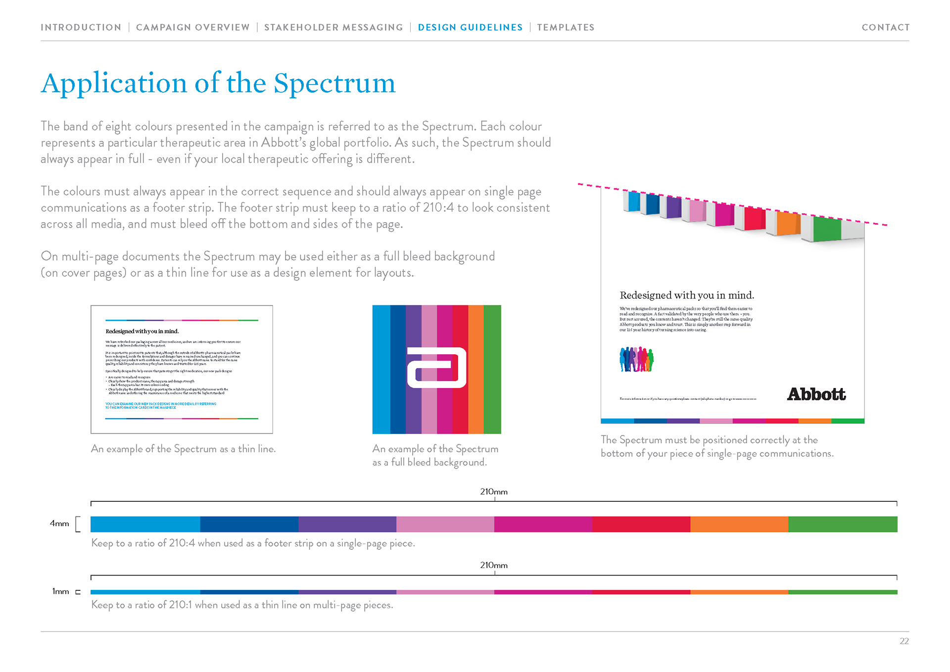
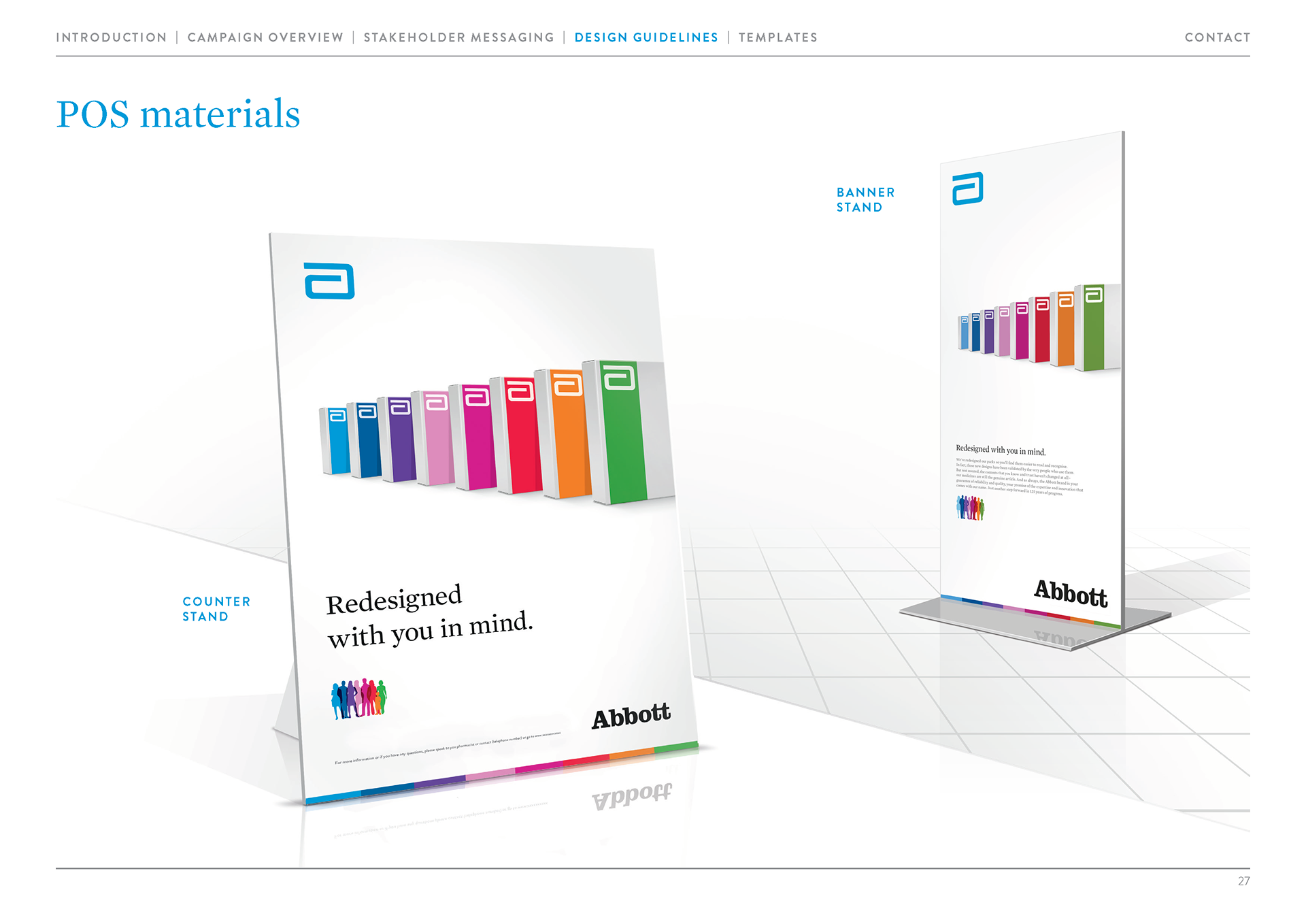
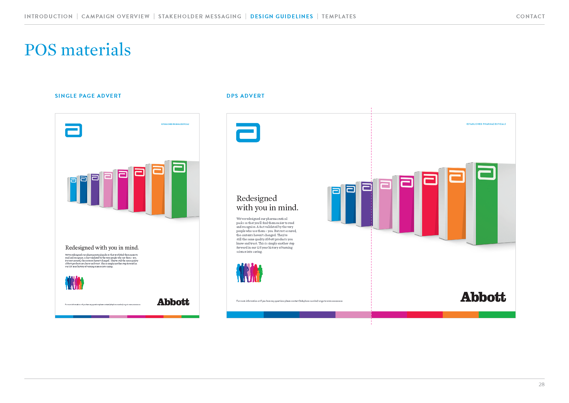
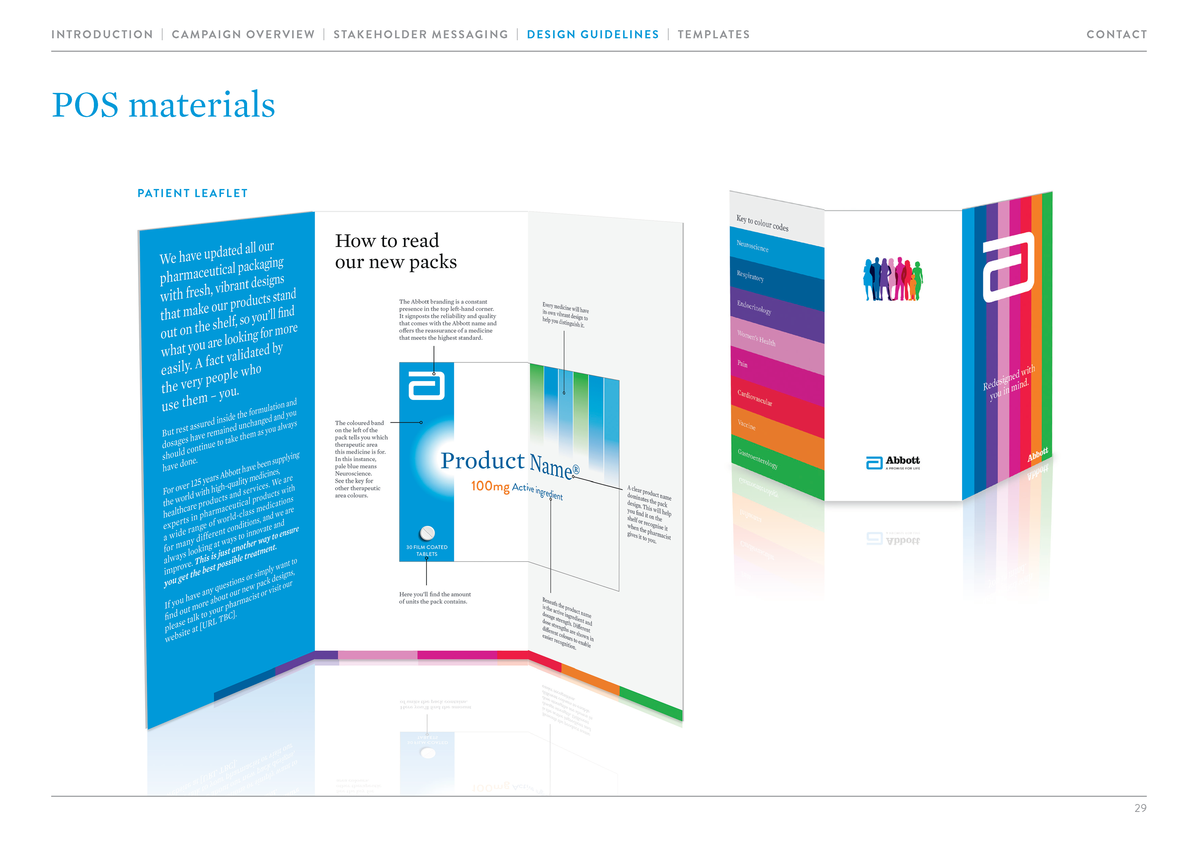
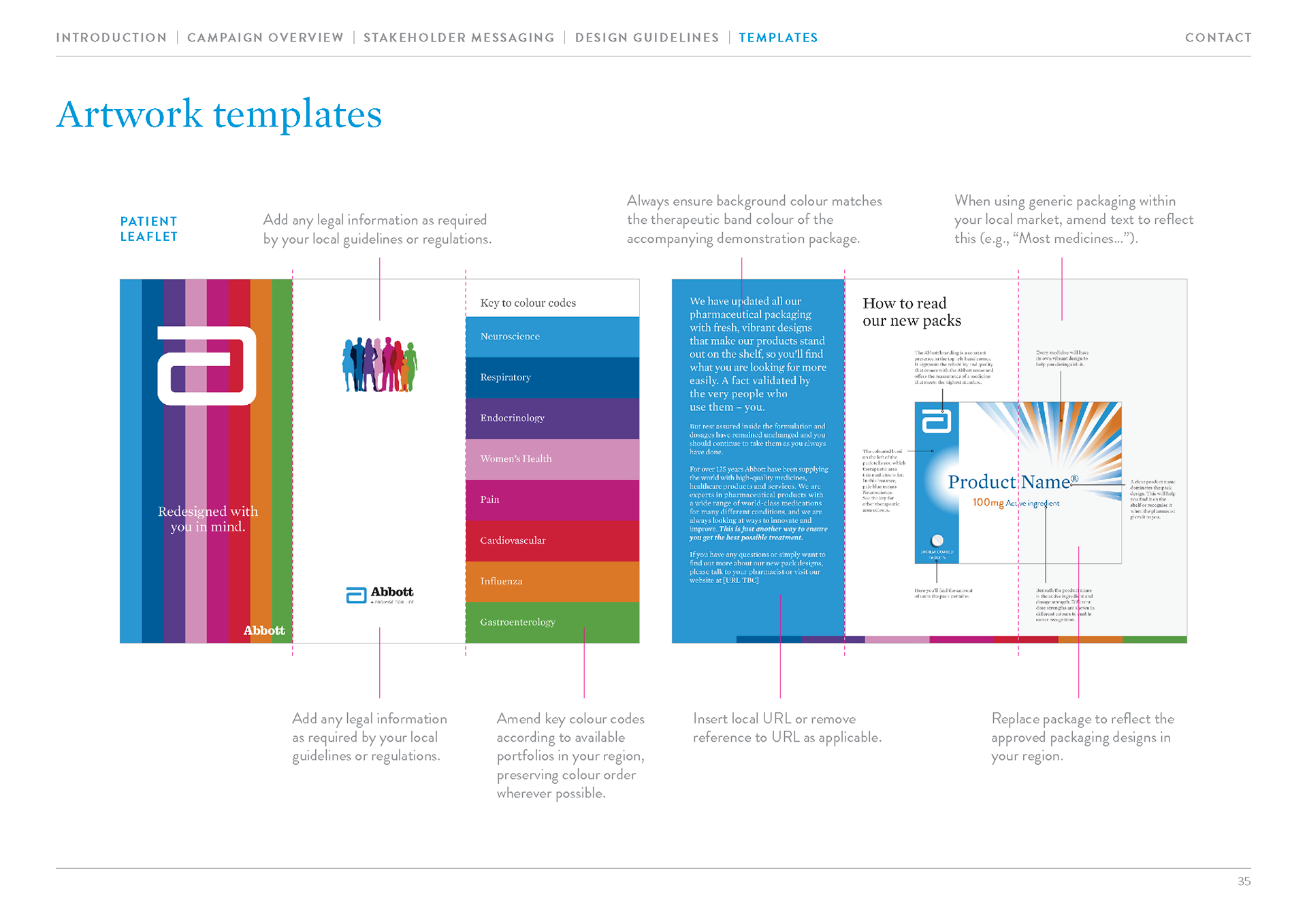
We also had to create the rest of the brand toolkit, as all that was already in place were the logo and the packshots themselves. To bring the colour palette and pack types together visually I conceived of the “spectrum”, a colourful bar that sat at the bottom of printed pieces which represented the colour-coding by therapy type introduced on the new packaging.
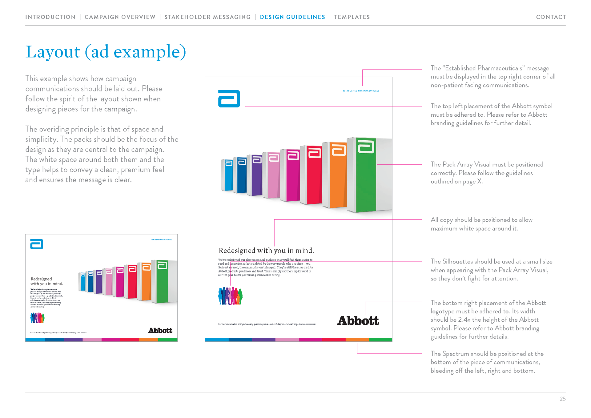
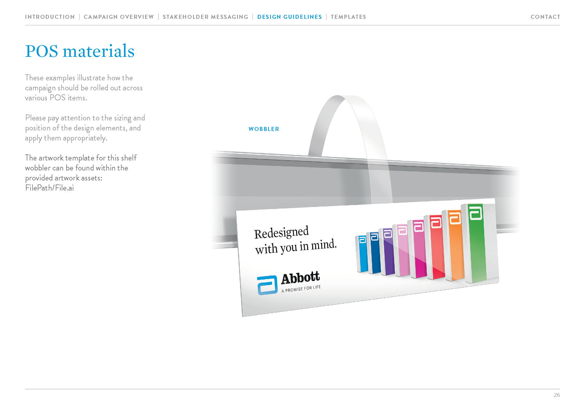
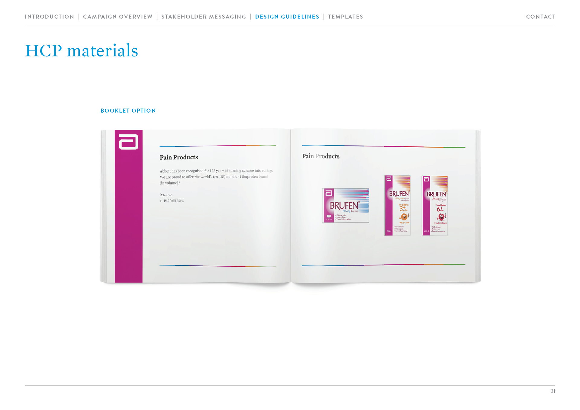
I also oversaw production of the “silhouettes” a vector artwork of patient outlines, overlayed upon each other to represent the end user in designs. Further to this we outlined: hierarchy of messaging depending on recipient; logo and logotype placement and usage; colour usage and values; typography; correct application of key art (packshots, spectrum and silhouettes); and there were also examples of adverts, POS usage, leaflets, mailers and booklets. I oversaw design and production of all these physical items, with templates included as part of the accompanying design toolkit.